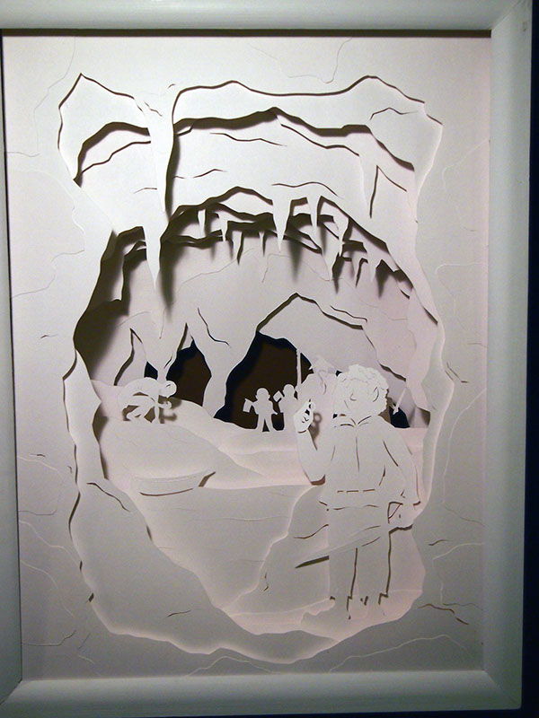
I wanted to look at 2D papercuts too, since I'm interested to make one or a collection of some myself.

If you look closely at the image, you can see the many layers of paper. The artist has added depth, which I find exciting and inspiring, while the figures are really simply drawn. The black paper in the background adds even more depth, but I would prefer some more colours, since some details get lost within the white paper.
The artist, Kate Weekes, has create many similar artworks, inspired by other famous fairy tales, such as Sleeping Beauty, Peter Pan and the Wizard of Oz.
I love how the artist has played with black and white, and negative and positive space. It's a simple image, with no many details, but still beautiful. Also, there is depth in this one too.

This papercut excites me for many reasons. It looks delicate and fragile, all the different parts of it are connected very subtly and there is also depth. The contrast of black and this olive green is great and the dragon figure interesting.

No comments:
Post a Comment